Introduction
This is the first part of a series looking at how games connect with their audience and how that connection may be strengthened over time.
It's a fundamental issue that falls into an awkward valley between design, marketing, store discovery, product/market fit (if you're from startup land), production, validation and community management.
There is a lot of ambiguity and confusion in this conversation: in the past, there's been too much emphasis on originality from the design side, and too much emphasis on genre from the publishing side. Game developers in general remain unsure about what "marketing" really is, or the purpose of community management; funders take on strange risk profiles and don't always give their portfolio companies the tools to succeed.
As the investor Jeremy Giffon said recently "all advice cancels out", so I'd like to set up several caveats at the outset. The biggest one is probably that no other input to a game development process should ever supercede finding the intersection described here:

There will be a PC-centric pay-once indie bias here as that is where I derive the bulk of my personal knowledge, and also that's where we have most data transparency in the industry currently; however, I do make conscious efforts to extrapolate that out into other areas. I define a "successful game" through a combination of profitability, exceeding stated aims and positive audience/critical sentiment - you may have another definition so feel free to correct for that as you read. I cheat and use one unreleased game as an example during the section on visuals (see if you can spot it!)
Catch, Hold, Build
The majority of game pitches are incredibly boring, particularly to publishing scouts who spend all of their time looking at new concepts. The audience is also bored easily: with nearly 11k games released on Steam in 2022 alone, they've seen most things before.
Modern culture is continually testing the upper bounds of individual attention, so in order to have any chance of breaking through the noise, developers have to think clearly about their terms of engagement.
I've seen many game devs blame "lack of marketing" for a failed project: the good news here is that "marketing" begins and ends with the product. It is not possible to turn a lacklustre game into a commercial success via paid UA wizardry or galaxy-brained PR stunts - those activities are merely vectors and multipliers for the promise your game is making to its audience - so expect to do the heavy lifting yourself from the outset. I will cover marketing activities in a future article but here, we'll focus on the intrinsic qualities of games themselves.
To reach anyone at all, your game has to catch attention. It then has to deliver on its promises, holding that attention so that the audience can build a relationship with it. Finally, you have to build your company and processes with that relationship at the core, forging a structure that sustains your creative efforts while continuing to serve your community.
The Catch

Catching implies positioning yourself to interrupt an existing trajectory. Interruption can have a negative connotation but in this case we're trying to make potential players stop in their tracks for a positive reason. They might already be heading towards a particular genre or style of game but the "wow what's that??" response still needs to be profound.
Here are the critical elements of the Catch:
Emotion and Surprise
A Catch needs to evoke a strong emotion. Here's some research from a related field: social media…
“Based on two data sets of more than 165,000 tweets in total, we find that emotionally charged Twitter messages tend to be retweeted more often and more quickly compared to neutral ones.”
Emotions and Information Diffusion in Social Media — Sentiment of Microblogs and Sharing Behavior — Stefan Stieglitz and Linh Dang-Xuan
“The frequency and amount of word-of-mouth were clearly larger for negatively and positively surprising experiences than for their non surprising counterparts.”
Inducing word-of-mouth by eliciting surprise — a pilot investigation — Christian Derbaix and Joëlle Vanhamme
There's plenty of such research out there but the gist is that strong emotion and surprise can compel people to take action. The examples above use sharing but the same process is applicable to looking at a store page or even purchasing. Too many game projects are "safe" or sensible, predicated on the technical abilities of the team or a desire to broadly fit into the market - without a spark, nobody will press that buy button.
You have an incredibly short timeframe to make an impression - research differs on this but it's likely only a few seconds - so if your game doesn't "pop" in a still frame or short gif, you are going to struggle. And yes, this applies even if you're making a complex strategy game or slow-burn simulation.
Familiarity and Originality
I've recommended the book Hit Makers by Derek Thompson many times before - it's an intriguing dive into popular music and the anatomy of a hit record. The concept that's perhaps most relevant to games is "Familiarity and Novelty": audiences go wild for songs that have a recognisable beat or structure, but which also contain some specific novel element, such as a new type of vocal tone, an instrument they haven’t heard before, or an unusual tempo.
"Novelty" can feel a bit reductive, so it's perhaps more helpful to think in terms of originality. This is often seen as an unqualified virtue in the game development community, and while it's true that gaming thrives on innovation, many of the biggest games in history were actually closer to "fast followers" than radical new ideas.
Familiar elements help the audience to orient themselves - success here is all about the interplay between the foreign and the known.
From Horrific to Wholesome
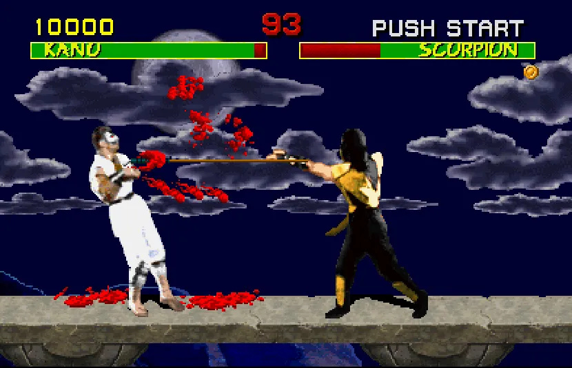
There's a reason that the Mortal Kombat franchise has persisted since its introduction in 1992. Like it or loathe it, its gory gameplay evokes a strong emotional response. Highly original at the time for its shocking visuals, digitised sprites and Fatality mechanic - yet relatively familiar to audiences who had already seen Street Fighter 2 and other earlier fighting games - it felt simultaneously novel and easy to parse. In 2012, Evan Narcisse wrote in Time that “the reason [Mortal Kombat] remains seminal is because it broke an implicit taboo about what was okay to put in a game”.
Plenty of games have shock factor but there was another element which made Mortal Kombat stand out: moral panic.
Again we can look to social media for an understanding of this: content with a moral or ethical inflection appears to spread more readily and evoke stronger responses. It can also be used to signal in- and out- group affiliations - when the audience can contextualise and post-rationalise its emotional experience in this way, it becomes more profound.
Mortal Kombat had some serious accusations levelled at it: it was decried as “violent, sexist and racist” in a US congressional hearing instigated by Senators Herb Kohl and Joseph Lieberman. Along with the dubious FMV romp Night Trap, it formed the nexus of a moral panic which led, in part, to the creation of the ESRB ratings board: the emotional content of a Catch can send shockwaves which extend beyond the game itself.
Games can evoke much kinder, subtler emotions as well. The humour and mischievous charm of Untitled Goose Game made a huge splash when it first appeared on Twitter: people responded immediately to the character - they'd never seen anything quite like it in a game before. But the familiar childhood picturebook-style setting, as well as the third person adventure / stealth gameplay, all tied together to ground these emotions in familiarity.
"Where most stealth games deal in the stark intensities of violence and death, Goose Game instead lowers the stakes back into the realm of comedy and slapstick, and comes off all the better for it."
Patrick Lum, The Guardian - Untitled Goose Game Review
Both Mortal Kombat and Untitled Goose Game are strongly evocative. We tend to think of genre audiences, demographics or other forms of categorisation as taking precedence in positioning a game - and those are all useful frameworks - but these are all effectively post-rationalisations. The key question should be "Does the game hit you in the face with emotion?"
Premise
With this key idea in place, we can look further into the contents of a Catch.
What's the game about and what is the player doing? Sometimes called "core fantasy" or similar, this is the broadest, most naive way of characterising a game: Skatebird is about a skateboarding bird; Gratuitous Space Battles is…you can probably guess.
Childhood games and imaginary play are an incredible starting point for a game premise. With play in childhood linked to the development of motor skills, critical reasoning and even empathy, it's no wonder that our earliest experiences of games, daydreams and imaginary scenarios have inspired scores of video game designers: think of Pokemon's origins in bug collecting, The Sims' virtual doll houses or No Man's Sky's evocation of classic sci-fi book covers. While there are plenty of examples of successful games which have confusing or ambiguous premises, something more focussed can pay immediate dividends.
Roleplaying is another appealing aspect of a game's premise. Obviously RPG's can allow players a huge degree of flexibility in how they express themselves, and showing that potential as part of a Catch can be powerful, but don't neglect the power of singular roles. The Red Dead series, or grand strategy titles like Crusader Kings tap into obvious power fantasies, but quirky "surely-that's-boring" simulators like Power Wash Simulator or Unpacking allow players to do things digitally that they couldn't before. These games inflect the mundane with the novel - as we know, that's often a compelling proposition.
One further caveat here: don't be too judgemental about "weird" or traditionally bad premises. Rocket League is a game that shouldn't have worked on paper - automotive aerial soccer is a very confusing offering at first glance - but the full package managed to be attractive enough to get players on board.
A premise can be a great locus of originality, with familiarity coming from structure and mechanics. If the player is roleplaying a lumberjack, acrobat, train driver or something more fantastical, easily comprehensible gameplay will help them pick things up quickly and translate that core fantasy into an ongoing experience.
Promises Promises
A premise, combined with the game's visual presentation, its genre and its messaging can become codified into a "promise": a bundled set of expectations and desires shared among the audience. Gamers are very keen on saying that developers “broke their promise” when a feature or aspect of a game they have inferred from their initial response to a Catch isn't delivered in a way that meets their standards. Possibly the most controversial thing I've ever written was about this topic with respect to No Man's Sky - the gaming community takes promises very seriously.
Keep the promise that a game might be making during the Catch in mind as we move on to look at visuals.
Art
Does the game have striking, stylised, beautiful or surprisingly realistic art? Is it exciting and attractive to look at compared with other similar games? Does the art imply that the game is substantial, or trivial and easily dismissed?
Beauty is famously subjective but it's still baffling how many devs are willing to pitch games with art that has no plausible chance of making an impact on anyone! We've all been there though - sometimes delusion creeps in, especially when resources are constrained or the limits of effort have been reached. Doing the "best you can" with art is often counterproductive - it might make more sense to reach for a simpler but more stylised look instead.
Most developers in the world don't have access to a cutting-edge art production pipeline but suffice it to say that if you are in a position commercially or technically to push the boundaries, then that is always one way of wowing players. High-end game art has become somewhat homogenised over the years - there are no longer the same paradigm shifts between console or graphics card generations - so targeted risk-taking in both creative direction and technical emphasis is the way to go.
This often boils down to a clarity of vision and resources devoted to early iteration. One major pitfall on high-end projects is a requirement for assets to be replaced mid-stream due to technical or stylistic shifts - time and money spent early on to establish creative pillars can go a long way towards avoiding this.
For those developers who many need to target something more pragmatic, let’s start from first principles. Here are two key questions when considering visuals:
What is the immediate impact?
What are the implications for the audience?
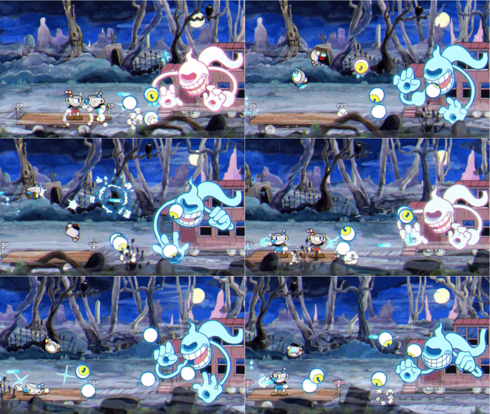
Cuphead is an example of a vibrant, highly nuanced art style which is something of a holy grail for games: it was revolutionary yet immediately recognisable and hugely impressive on a technical level. It made the game a "must-play" for many - they just had to experience everything it had to offer.
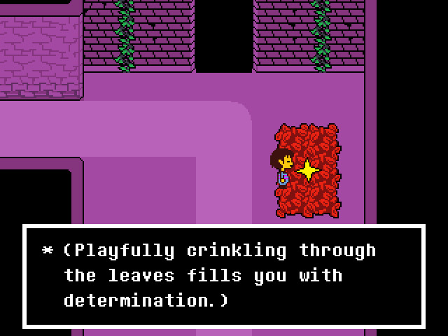
Undertale's visuals belie its depth but they also provide a lo-fi nostalgia, sharing some influences from both 16-bit RPG's such as Earthbound and internet cultural touchstones like the webcomic Homestuck. While art like this can sometimes make a game easy to dismiss, here it played in the creator's favour, drawing in an audience who revelled in the game's quirkiness and narrative complexity.
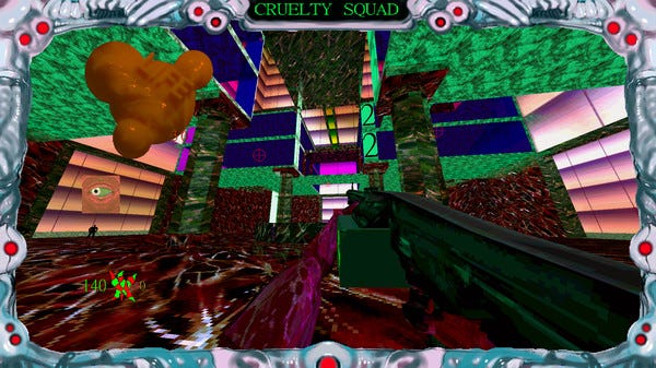
Sometimes "bad" or "naive" art can be extremely powerful - Cruelty Squad's palette vomit rendering disaster car crash visuals really stop players in their tracks. Why would a developer make something so abrasive and confrontational? The game's esoteric world and gnarly detail are completely evident on a first look.
Games with tremendously deep mechanics such as Rimworld, Dwarf Fortress or Caves of Qud often work best with very clean, pared-down, simple visuals. Not only is this a necessity due to the vast amount of content required by such games but it also is an advantage when it comes to differentiation: the intriguing graphics here imply vast complexity, which attracts the right kind of player. A huge amount of information can be displayed on screen at once, illustrating the game's richness.
Graphics need to tell the game's "story" immediately - is this going to be a worthwhile experience for the player? They need to directly imply how the content of the game will create emotional value as well as selling the initial emotional impact.
A Rogue's Gallery
There are some broad "visual genres" which crop up frequently in successful indie titles that can give us clues about how the gaming audience perceives art. You may disagree with my buckets or terminology (please feel free to let me know if there's a clearer way to express some of these, or if the groupings don't make sense to you!), and I'm aiming more for "technical bounds" than highlighting specific thematic content: you could make a cartoonish or horrific low-poly 3D game, for example.
(By the way, my new album will be called "You May Disagree with my Buckets.")
Interface
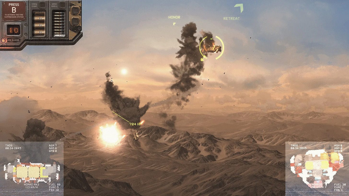
An "interface" visual style leans heavily into exposed UI elements, bare-bones practicality and occasionally the metaphor of a computer terminal itself. This style can be a great starting point for a more mechanically complex game, as it allows for a very high degree of content flexibility while presenting an enigmatic front to the player. What may seem at first glance to be a cold and stark visual style in fact implies control, detail and depth to many players. More common in older indie games - and potentially a limiting factor for mainstream audience appeal - it still can be a clever choice for lower budget games.
Skeuomorphic
"Skeuomorphism" is a term which refers to an interface that attempts to mimic a real-world object. Obviously, there are strong crossovers with Interface games here but where those titles might be mimicking a computer terminal or HUD, Skeuomorphic games often take a hybrid approach with "real world" objects alongside more abstract gameplay views. In several modern indie success stories, a book is used as a framing device - this can be a popular way to immerse the player in a fantasy or medieval setting.
Restricted Minimalism
This is quite a broad category but some common themes here are:
Constrained - occasionally fully monochrome - high-contrast palette
Highly consistent simplified forms
Low-detail, stark depiction of human characters
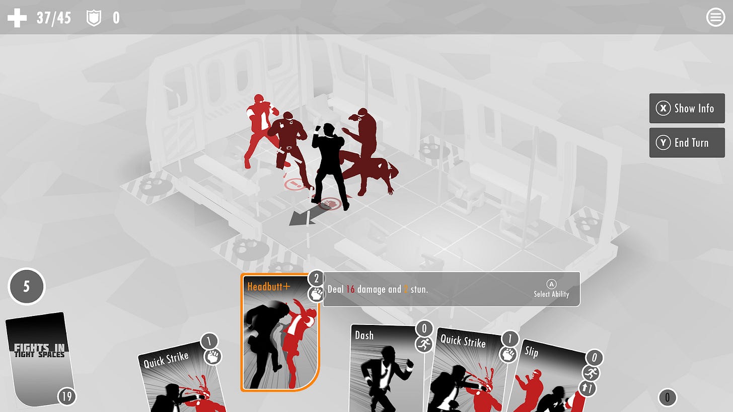
The style moves away from the iconography of Interface games to something more directly representational - it is useful for showing human characters without the need for complex facial animation, high detail models, expensive lighting or materials. Emotive violence, horror or drama can be conveyed with minimal resources - the mind of the viewer fills in the blanks. There is some significant crossover with "Low Poly" as mentioned later but the games I've highlighted there tend to explore a much broader colour spectrum.
Low-fi Pixel Art
Traditional pixel art is a very tricky style to get right - done poorly, it can seem cheap and messy, both traits which often cause gamers to switch off. At the more "lo-fi" end of the scale - often a more practical zone for indie developers to occupy in terms of cost - the game needs to justify its art. In the examples I've given here:
FAITH is a dramatic and emotive horror game published by New Blood, an indie publisher with a huge cult following.
Vampire Survivors is an infinitely replayable genre defining breakout hit
Downwell is an earlier modern roguelike that combines a pixel art style with a minimal palette and gained traction through another "indie giant" publisher, Devolver Digital
Rise to Ruins is a hyper-deep colony sim / tower defense game
Essentially, there has to be "something else going on" if you opt for a very low-fi pixel look - the audience needs a specific reason to appreciate the raw, stark stylings of your game, so there has to be another "way in" other than purely aesthetic appreciation.
Hi-Fi Pixel Art
Ultra detailed, lavish pixel art is another story - this can win players over with its innate charm and self-evident craft. It can suit games with a rich, expressive world, conveying the idea that this is a place where any player would love to spend time. It can be an expensive and time-consuming style, but is a perennial favourite if executed well. Increasingly, developers are throwing in hybrid 3D elements or other tricks to add perspective depth and get maximum bang-for-buck from this style, so it's certainly possible to mix things up while retaining the feel.
3D Retro
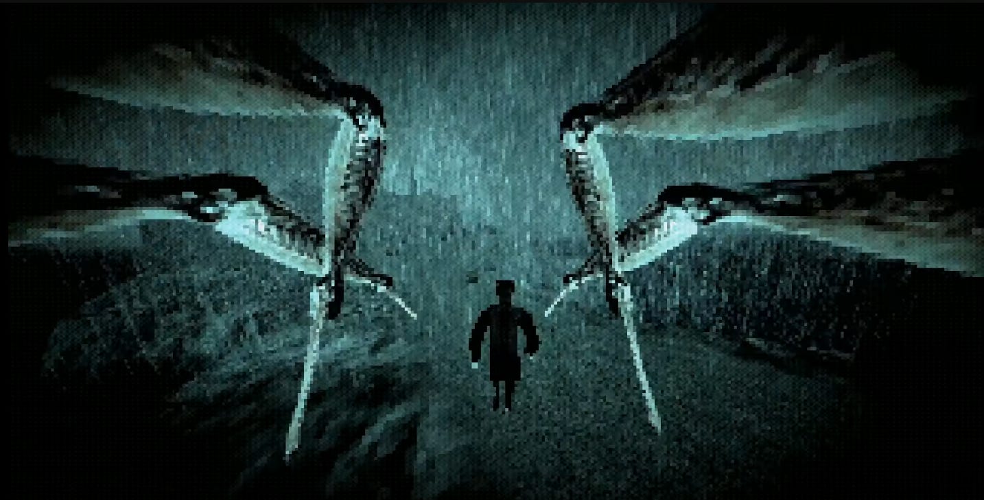
These styles, which range from DUSK's somewhat nostalgia-driven Quake-esque look to the "PSX horror" of No One Lives Under the Lighthouse have emerged in more recent years as AAA graphics depart ever further from the 3D seen in mid-to-late 90's games. They're great for immersive environments but can be challenging to pull off while creating a differentiated look.
Low Poly
Much has been said about this style throughout the lifetime of modern indie games (particularly since Minecraft, although its status as a true "low poly" game is somewhat debatable) but it still remains a fruitful playground, as the enormous success of recent games like Battlebit Remastered goes to show.
Hi-fi Low Poly
[Thanks to Andrew Smith and others on Twitter for the name!]
As low poly games evolve, smaller devs have been layering more effects and detail on top of simpler models to create a style which sits midway between the rough-and-ready Minecraft-esque look and a full-blown AAA extravaganza. This work requires many more resources both in terms of technical art and content creation, but can result in some awe-inspiring visuals that don't need to break the bank.
Diorama
[Thanks to Azure Midsummer and others on Twitter for the name!]
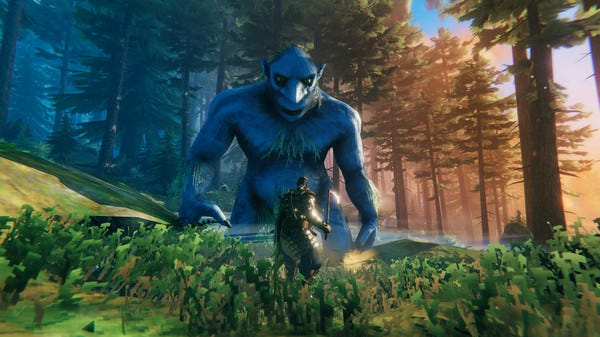
This hybrid style pairs 2D "billboard" style foreground sprites (usually characters) with a much more detailed background (often rendered in 3D). It's a clever way of minimising character art content while making the most of the flexibility of 3D rendering, allowing for masses of content and world detail in survival and RPG-style titles.
These are just some of the buckets that lower-cost or indie game art can fall into - by illustrating these, I hope to show how any given game has immediate visual comparators simply by virtue of picking a lane in terms of its overall visual style. Once that choice has been made, looking at ways of maximising and differentiating are absolutely critical.
That isn't to say that there aren't complete outliers. It is still possible to innovate radically new styles, such as UNRECORD's hyper realism, which caused quite a stir on social media given its subject matter:
Of course, there's nothing new under the sun, as surprisingly realistic or mundane environments have popped up in indie games from time to time, so it's always about inflection, technological specifics and individual creativity:
Studios can build up their own visual identity through iteration and an exploration of common themes. One great example of this is Supergiant, whose hybrid 2D / 3D workflow, choice of bold colours and impact FX sends a strong signal about their heritage as a developer:
Finally, with all the good will in the world towards the artists involved, there are games that truly break all the rules. While the undiluted genius of Among Us' iconic character design can't be denied, its overall look is one players might associate more with game jams than multi-million selling titles:
This is all part of the charm though - a fun, approachable and readable style goes a long way when you have compelling gameplay. It's also played for laughs brilliantly with the game's more horrific elements.
Art needs to tie the promise of a game together - it needs to reassure the player that the developers are in control of the tone, and that they are going to deliver on the atmosphere and world they are suggesting. But more than that, art is a cue to gameplay - players automatically assume that games which look alike play alike, and those cues can either be a strong positive or negative first association.
As we covered at the outset, game art isn't a technical or skill-based competition: its main functions are to catch attention and then tell a story to the player about the long-term relationship they will form with the game.
Another huge component of that story is genre.
Genre
The author Seth Godin makes a useful distinction between the concept of "genre" and the term "generic":
"Not generic, which is boring, but genre, which gives your audience a clue as to what this work is about.
What’s the format? What should it cost? What does it remind me of?"
Seth Godin, The Practice
As he says elsewhere in the same book, genre is there for creative people to "leverage against":
"The people you bring your work to want to know what it rhymes with, what category it fits in, what they’re supposed to compare it to."
Genre is often the first thing players look for when browsing Steam, so why didn't I begin this article with it? The reason is that genre-based thinking can frequently be overly reductive for devs, publishers and other stakeholders: "deckbuilders are hot right now so we should make a deckbuilder". This kind of rigidity can cause us to push way too far into familiarity while neglecting emotional impact, and also write off concepts which may have huge potential simply because they don't seem to fit in an obviously popular category. Chasing for its own sake genre can also lead to creative sterility - there has to be a stronger core to any project.
Defining Genre
Developers can sometimes be confused by the variable ways in which the gaming community discusses genre: "horror" may refer to a set of stylistic values, as well as to a narrative genre; "shooter" is an ultra-broad category; "roguelike" is a gameplay structure - and so on. Without delving too far into semantics, it can perhaps be most helpful to think of genre in games as a vague heuristic which aids recognition: it is a key part of a player's decision to invest their time and money.
Thanks to Steam, it's easy enough to find information on which genres are both popular and attainable for devs at a variety of budget levels. Via Steam tags, and some useful analysis work by discoverability experts like Simon Carless and Chris Zukowski, we can see that PC players favour genres like roguelike deckbuilders, 4x, simulation, RPG's (both turn-based and realtime) and city building.
These are (broadly) descriptions of sets of mechanics: we would expect a roguelike deckbuilder to have somewhat random hands of cards; in a city builder, the player is likely going to be organising structures and perhaps advancing through some kind of tech tree - and so on.
What do all of these genres have in common? The easy answer is "depth" but let's try to break that down further:
Large scope of content, often involving procedural generation
Opportunities for system creation and iteration
Long playtimes / high retention
A high degree of player creativity and variant playstyles
The designer Justin Gary highlighted five traits that players seek out in games during his appearance on the Tim Ferriss podcast:
Immersion
Social Connection
Aspiration
Growth
Expression
We will get into these further when discussing Hold, but for now we can consider them part of a game's value proposition to the player. While Social Connection may not be quite as evident in some of the genres I've highlighted, any game that allows players to share their work with others or seek out extrinsic information from the community does feature a social element: think of the Prison Architect subreddit where players share their abominable penal creations. System building, emergent content and readability all play their part in those sort of social transaction.
The Duality of Game
A game will catch attention if it demonstrates these qualities upfront, in as economical a manner as possible. A lot of modern hits take a very binary approach to this: recent smash RPG Baldur's Gate 3 presents itself clearly as both an immersive, character driven game…
…and a highly complex multi-dimensional system which allows for an immense scope of player experimentation and growth:
Its genre and overall positioning, as well as the D&D license send a very strong signal to players.
Similarly, FromSoftware Armored Core VI Fires of Rubicon leads with bombastic high-tech mech combat:
…but also promises hyper-detailed spreadsheet-style customisation:
These games promise the player immense potential and character-centric efficacy once systems are mastered and numbers tweaked efficiently. To be mechancially skilful and correct at a base numerical level is to be powerful in the world.
RPG elements particularly have crept into many more action-oriented genres over the years for these reasons, simply as they offer a clear path to Aspiration, Growth and Expression in Gary's terms.
It’s not enough to simply bolt on detail to any old game though: developers need to have an intimate understanding of audience genre expectations in order to make promises that include them.
Defying Gravity
What about games that don't sit neatly in existing genres or seek to carve out their own space entirely - Blue Oceans or Law of Category Purple Cow outliers? Surely it’s good to aim for something nobody has ever seen before.
Remember familiarity and originality. Yes, it can be a fantastic idea to create a new category - many gaming success stories have done so - but this still needs to be grounded in something the audience can comprehend.
Equally, we should never write something off because it seems awkward and hard to place - instead we need to look at how it takes on the traits of existing genres but runs with them in a new direction. Left-turns that developers can take include adding social or multiplayer features to previously single player genres, ramping up or down difficulty and approachability, adding immense complexity to a previously trivial element, changing perspective from 2D to 3D or vice-versa, using an unusual theme or simulating a core behaviour that hasn't previously been explored in a video game.
The key for this type of work is to not become unmoored from the audience completely - unless of course your goal is complete alienation, which can be creatively valid but is challenging commercially for obvious reasons!
Deep Impact
If you can align your game's premise, visuals and genre in the service of making a compelling promise to players about the experience they will have with your game then you will likely cause a reaction. If you have a concept which can make a tremendous impact then feel free to throw all theory out of the window: only impact and depth truly matter to players.
The joy of game development is that any method of hitting those two targets is valid - if it's visiting an art gallery and choosing a visual style that nobody has ever seen in a game before, doing something "impossible" that other devs have neglected, making a game about goats or finding an unusually cheap way of delivering content that normally would be associated with huge budgets…there are a million ways, and the mechanics of delivering the impact are immaterial.
Caught Up
In Part 2, I move on to talking about The Hold - what really makes players stick around for the long-term and feel satisfied that a game has delivered on its promise? Take a look here!


